Wednesday 24 April 2013

Final patterns


This is one of the final pattern ideas I have created out of one of the symbols. I really like it. It is quite an intricate repeated pattern. I am going to define that the artist using the stencil can do anything that he likes with it so long as he does not alter the origional stencil shape in any way. Here, I have overlapped the stencil and rotated it and the final pattern is very interesting indeed. I think that it is the right feel for an artizan quarter. The pattern has a handmade quality to it- it is not perfect in construction but I like that. Also, the pattern has an element of sophistication about it- it is not going to make Fargo Village look like a toy town. I have added a light texture to the pattern. 


This is another final pattern idea that I have created from one of my stencils. Below- I love the way that the rough edges to the lines are highlighted when the shapes overlap and are tessellated. I create 
new shapes and pattern. Also, I think it is effective that non of the shapes are symmetrical. 


I have also come up with a new way of working for producing the numbers that will go onto each Warehouse. I am going to define that the stencils for the numbers are to be created by the artist creating the pattern. They may be influenced from any number on Far Gosford Street for the creation of this stencil, providing that the number has reference to the history of Far Gosford Street. I will define a general size that the numbers should be in my examples of warehouse designs. The number is to be printed in black onto the building and the type style used must have a decent amount of weight to it, so that it stands out against the pattern it will be placed onto. 


Above are two examples of using the patterns that you can create with the stencils on the walls of Fargo Village. At the moment, the warehouses are in the transitiional stages between being renovated and them still being used for storage for companies so the place is very messy. There are only a few walls which are clean and which have the possibility of digital editing. This is one of them. I have experimented with two ideas for backgrounds to the stencil. I think that if I put a dark background onto all of the walls of Fargo Village, because it is a contained area you would be surrounded by dark colours. I want the atmosphere of Fargo Village to be uplifting- a nice place to be and to spend time in. A dark background would create an oppressive overall feel. 
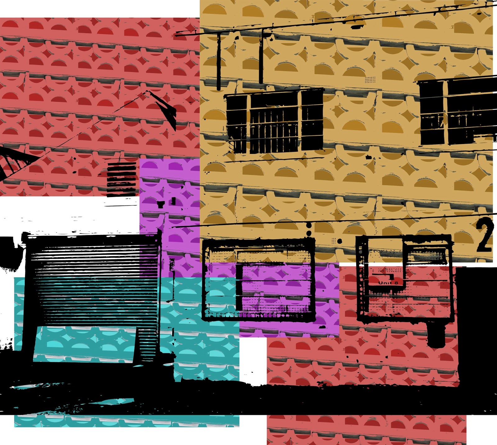

Final Examples


These are the final examples that I am going to use to construct my sheets which outlines the design process of the buildings. The numbers have been placed onto the warehouses so that the artist can get a feel for a correct size and positioning of the number, though the actual number form is completely up to the artist creating the pattern  (as already defined). I have also created a slightly off white background colour to the patterns, it is a cream colour that just gives them a slightly more sophisticated feel. 


Thursday 18 April 2013

The final delivery of idea


These are the final sheets that I have constructed which outline the concept for the process of designing the warehouse surfaces in Fargo Village. It includes the colour scheme, the stencils and how the stencils should be used, the logo type, and examples of correct application of stencils. I am very happy with this project outcome. It has involved a lot of work but I think that the end result is a way of making Fargo Village really something special.  The stencils reflect the history of the street, but the way that the stencils are used to create patterns reflect this new, exciting vision. The patterns have a hand-crafted feel that is perfect for an artisan style shopping experience. The concept gets the community involved which the developers are keen to do. I am going to make an appointment to see the developers of Fargo Village to show them this concept. Though they cant make any changes now to the decision of the design of Fargo Village, I think that they will be interested to see another interpretation of the area. 

Thursday 4 April 2013

Development of the logo

Now that I have the final ideas created for the surface of the warehouses in Fargo Village, I am going to create a logo which will re-brand the space. I want it to be inkeeping with the overall style and visual feel of the wall patterns, so I am going to create the logo using one of the stencils for Fargo Village pattern creation.


Above is the starting point to inspiration to my logo that I am going to create. It is a photo of an engraving into one of the walls on Far Gosford Street.  I particularly like the type that has been used. It is a very interesting serif font and is Victorian in style. This has given me inspiration to use Egyptienne. This is a typeface that has been modeled on a Victorian serif font. I like the varying stroke widths and the length of the serifs on the capitals. it makes for a visually interesting and dynamic font which is also immediately associated with history- it is clearly Victorian in style. 


This type is created using the same process that I used to construct my typeface that I did not continue with. I have put a drop shadow on the type. I have also used the layout that is seen in the wall engraving. I like the idea of using the letters FV instead of writing Fargo Village. 


This logo is getting somewhere. I prefer it without the thick black boarder. It was too strong and took your attention away from what was going on inside the containing box- the logo. I am not convinced by the type. I have got rid of the drop shadow, I think that the idea did not work, it was not aesthetically pleasing. It was creating lettering that looked childish and my design for the buildings of Fargo Village have a sophisticated feel that I want to echo in my logo creation. 


My idea is not taking form. I have got rid of all of the unnessecary elements-these are the drop shadow to the type, the outer stroke to the type and the background shape that the logo was sitting on. Now, I have a logo that is looking more sophisticated. It is well balanced and easy on the eye. The F V sit well in the two diamond shapes- the lettering become part of the design, it is not an afterthought. However, I think that the vertical height needs to be balanced by extra elements on the horizontal axes. 


This is looking really effective. The extra shapes either side of the logo give the logo more balance, it is more assertive in presence. Also, it helps with the visual presence of the text. The text now sits more centrally in the logo. 


I thought that I would experiment with trying to create the letters FV out of the stencils. I really like the concept, but when excecuted the letters are just over complicated. A simple solution is better. I actually really like the previous logo attempt and this is going to be the final logo design for Fargo Village. 

The final logos


These are my final logos. I am going to be outlining in my guide that the logo may used in any of the Fargo Village colours from the colour scheme I have defined previously or black. I have also added a texture to the logo so that it is in-keeping with the textured look of the patterns on the walls of Fargo Village warehouses. Overall, I think that it is a successful logo design because it reflects all of my intentions of Fargo Village design. It conveys the history of the street- seen in the egyptienne typeface that I have selected for the logo and the stencil that I have used to create it which derives from a piece of historic architecture found on Far Gosford Street. It also conveys the fun, engaging and creative vision that Fargo Village is all about. It has the visual attributes of an artisan logo. Its rough edges and textured finish create a hand rendered, printed feel. 


Saturday 23 March 2013

development of final stencils

I have decided that I need to make these shapes instead of live tracing them. The edges of live tracing architectural features are coming out too textured and too rough. I got lucky with the previous stencil ideas that I created.  I am going to create the patterns by tracing the architectural features myself with the pen tool .Only this way will I get a stencil that I am completely happy with. I can fully control the design of the stencil using this process.


I do not want symmetrical perfect symbols as this would create a corporate image, instead I want quite a free flowing set of stencils that have broken lines and odd unsymmetrical shapes. 


This is starting to look much stronger now as a stencil idea.  


Through deleting one of the sides I have created a much more abstract shape that is unrecognizable as a pillar. Now, the shape looks like a stencil that is ready to be used to make printed imagery onto the building. 


With this one that I have already made and put into a design, I actually don’t think it is too bad. It has not got too man sharp edges and corners and is rather abstract. However, I will remake it so that I can make all of the lines smooth and make a stencil that is easier to create and use. I need to remember that this stencil will be actually used, therefore I also need to make sure that it can be used as a stencil. 


I am experimenting with a few places to get a pattern from this building. I am experimenting with different ways of highlighting the shapes without being overly obvious about what they are. I particularly like it when I am just looking at the shadow of the textures and patterns, and so this is what I am going to focus on when exploring stencil ideas. 


This stencil I have created is pretty powerful. There is a subtle depth of field, trickery with perspective which I quite like. 


Again, I am tracing around shadows of the building, however this one is not going as successfully. 


This is the pattern of the top of one of the roofs. I quite like it, and I think that to turn this into a stencil, I am going to take the drop shadow of the circle centers and the background sky to make the solid colour of the stencil, and the actual brick I will make the negative space. 


This hasn’t worked so well. I think that the shapes need to be isolated, and not be contained in a squared off background. Therefore I am going to try other areas of this image to vector. 

I am really struggling with this shape. The problem is that I cant create a shape with circles cut out of the centre because then it is not a stencil that works, the middles will fall out. I need to rethink it, so I am going to move onto another stencil design and come back to it. 


I am quite excited by the prospect of making a stencil out of this one. It  should be quite fun to make and it is a bold shape this is going to stand out. 


This is my first attempt at the shape. I have done it so that the x is not immediately obvious, and just highlighted the shadows. It think it is fairly effective  and when the texture is applied so that it looks like it has been applied to a wall surface, I think it will look most effective, but I am also going to try it where I have the whole shapes in the image rather than just the pattern, as I can delete areas of the stencil when I create the textured wall patterns. 


This is much more successful, it is bolder and more confidently produced. It will make an interesting wall pattern. I will apply a heavy grain on this image when creating patterns. 


This is another really nice simple pattern that I have found. I am going to do a similar thing to what I have done with the previous stencil idea, however this time I am going to make the stencil out of the light areas, this way I wont be creating shapes with holes in the center that will fall out. 


This is a successful stencil. Its bold and striking and should look great when I put it on a building as a pattern. Also, the rough edges and almost childlike construction of line reflects my concept well. 


This is a pattern on a medieval building. It is quite stereotypical of historical building pattern and is something that I was thinking about staying away from, as I want the stencils that I create to have a quirky and fresh feel to them. However, after looking at this, I think that if I inverted it so that the stencils were made out of the white zones then I would have a stencil that was a little bit different but still reflective of this building surface design. 

I quite like how it is not straight and parallel  and that the corners have slight curves. Again I believe that this is going to make a very interesting pattern when I come to designing final building surface patterns.


This pattern is also quite interesting. The stencil here is pretty much done for me. I just need to turn the black areas into a vector shape. 


These are the 3 patterns that I have got from this, but I think I need to neaten up the shapes before I use them and call them a final stencil idea. Either that, or I just focus upon one shape.


I have decided upon one shape that I will use as a final stencil. It is very simple, but on a large scale I think it could work. 


It is fairly obvious what I need to do here to make a stencil out of this pattern. I am going to trace over the centres of these bricks, and then the pattern that is created above the brickwork that is highlighted by the sky I will also turn into a vectored shape. Then I will see if I need to do anything with the brick that is underneath. 


I have done that idea, and I think that it definitely needs the lower part, or it needs more of the top part of the stencil. I will try both ideas. 

After playing about with both ideas, I have decided that this is the successful design, as the others either look too obviously like the original pattern, or the line underneath actually looked like a face. 

So, now I have a set of final stencils. I am going to start using these final stencils and turn them into patterns that could be created by the artists who I propose should use these. 


Thursday 21 March 2013

Further pattern development- stencil creation


I need to start to give the patterns that I am creating some structure. I have worked out my intentions for the general feel of the patterns for the building. They will be repeat patterns using one stencil. The stencil can be overlapped, tessellated  rotated etc, (not scaled as I think this would get confusing and also it would be unpractical to have more than one stencil size). I need to think about the actual quality of the stencils. They have to have a rough edge to them. I do not want them to be clean geometric shapes. I want them to look rough and ready, unpolished. 


This is an attempt at creating a stencil for pattern creation. It is a pattern that I found on one of the historic buildings in Fargo Village- a piece of roof detailing.  I quite like the roughness of the lines. It has been created by fine tuning the live trace tool in illustrator. I think that it could do with neatening up a little but overall I like the texture and overall rough and ready quality it has. I am going to experiment with using it as a symbol to create patterns. 

This is looking very interesting. I like the intricacy of the pattern. Perhaps this is something that I will explore in the final pattern designs? Perhaps the patterns could be very beauitiful, intricate things and the stencil that is used to construct them be very small?

I am starting to think now about how these stencils can be produced as final objects. I have recreated this stencil. I have now taken into consideration that it is in fact a stencil and cannot be composed of elements which have elements inside them (obveously because they would fall out of the stencil). I have also heavily simplified the stencil. I inverted the image so that I could get a trace of the negative. This has produced a more interesting symbol. I like the fact that they are hard to tell what they actually are an image of. 


These patterns with this new symbol are working really well. i created a repeat pattern that I then made into strips. These strips have been overlapped with interesting results. I still like the idea of creating stencils for the numbering of the warehouses. I think that this is an idea that is going to continue through the development of the project. 


Now that I have a way of using the stencils, I am going to construct the final stencil ideas. 


Monday 18 March 2013

Initial ideas for new, textural patterns


Above is the piece of architecture that I am going to use to be inspired to create my first initial pattern. Now, my attention turns to making patterns that have a repeated quality to them and also more of a handmade finish. I do not want these patterns to be clean in design as I have already made this mistake in previous ideas and the consequence was that the patterns looked too corporate. 


I do quite like where this is going. It is just a really quick, unrefined idea where I have taken the image and repeated it. I quite like the roughness to the image. I quite like it as an initial concept, I could imagine a refined version of this across the wall of one of the warehouses in Fargo Village. 


Here, I am just experimenting with layering of the pattern I have made over the image of the warehouse, in a similar fashion to the collages of Corinne Wasmuht. It is an initial concept of how I could possibly layer the patterns onto the buildings. Perhaps, when I give a stencil to an artist, I could suggest that instead of covering the whole wall of a warehouse they just cover a small section of the warehouse wall? This way, I could define that patterns like the above are created. Also, look at the number in the middle right of the warehouse just bleeding off the edge of the page. The image has been created by vectoring the outline of the warehouse. I only did this so that there was some contrast in the outline so that it stood out against the pattern and was visible. However, this number is particularly interesting. Generally, warehouses are numbered when they are used as their original purpose which is storage. Perhaps I could play on this idea? Instead of writing words describing the type of shopping experience in each warehouse, I could number the warehouses. 


Another initial idea for a pattern. This is definately getting somewhere. I have taken a piece of brickwork pattern and made it a vector through the live trace tool in illustrator. I have then layered the outcome with interesting results. Also, what is worth noting here is this pattern could actually be created using a very simple stencil. I am going to develop this pattern idea as I think that it is starting to work, it has the hand rendered, textured qualities and repeated but unsymmetrical properties that I am after. 


I am really liking this idea. i have taken a pattern inspired by some architecture detail underneath the edge of a roof, vectorised it and repeated it to turn it into an interesting pattern. The number on this warehouse front idea is just a visualisation of an initial concept but I think that it works effectively against the patterned surface. The numbers too could be produced by using a stencil. Maybe I could experiment with creating numbers out of these stencils?