Wednesday 16 January 2013

Poster Idea

Now I am going to take the research of the London Brick Lane and use it to create a creative poster advertising Far Gosford Street. My main focus will be on colour. There is colourful brickwork everywhere in Brick Lane and this will be my starting point. Far Gosford Street lacks colour and art. Therefore, to show Far Gosford Street in a colourful vibrant way will highlight the intentions of the development.


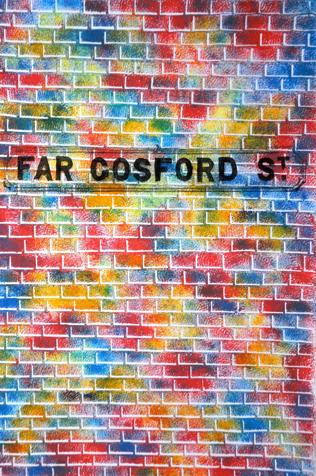
This is the first attempt of my poster. I have made a stencil for the brickwork and then printed paint using a very course sponge through the stencil. The colours are reflective of the graffiti down London's Brick Lane. The piece is only in its early stages, but it is bright and colourful and conveys this new creative artistic Far Gosford Street in the way that they want it to be portrayed. At the moment however, it is unsophisticated. The Far Gosford Street sign is just an overlay in Photoshop  and I do not like the angle that it makes on the brickwork. I am going to try completing the poster horizontally and on larger paper so that the brickwork is smaller and more intricate.


This is the construction process of the developed poster. The stencil has been laboriously cut out by hand so that it has a handmade miss-match brickwork feel to it. This reflects both the creative aspect of the street and also the medieval construction of some of the houses down the street. Brickwork and woodwork is not constructed with even horizontal patterns, similar to my brickwork stencil. 

This is the developed poster. I actually really liked the stencil that I printed through as well as the print itself, so I have encorporated this in the design. I have displaced the stencil slightly on the print so that you get a white outline on some of the sides of the brick, giving the poster a 3 dimensional feel. I actually think that this effect is quite effective. However, it is becoming confusing to understand. The colours are a lot better in this piece- they are bright and bold and vibrant, but there is  more brickwork so the piece looks more sophisticated and considered in design. One of the issues that I have with this piece is the Far Gosford Street sign. I like its placement and what it is trying to suggest- its the origional street sign for the street and so conveys the rich history of the street against the vibrant and colour future, however it is still just a digital edited overlay and so does not work. I think I am approaching a final solution to this poster, but there is some things that I need to consider in the final production:
  • The posters that I hand over I want to be origional pieces of artwork rather than digital printouts as the origional artwork has such a better, more tactile and textured quality. Therefore I will not be handing over any digital copies to the client, only copies that are produced by hand. Therefore, every poster I hand over will be unique in some way as I will not be able to, or want to colour match the posters every time I print through the stencil.
  • The Far Gosford street sign I need to produce by hand so that it works with the rest of the poster and has an overall handmade quality. Therefore I will screenprint this sign onto the final designs. 
  • Some of the posters I produce will have different hues to them. This is so that they will have a poster that will suite  a number of different environments (this way the posters are more likely to be displayed more frequently), whilst maintaining the colour scheme of the London Brick Lane artwork. 


This is the production of my final posters for this idea. The Far Gosford Street sign has been screen printed. I really like the way that this has come out, I think it is effective against the brickwork. It has a really nice textured look to it that compliments the heavy texture of the coloured bricks. I have produced 7 of the posters, each are individual. 6 of these have now been handed over to the client, I have retained one. I hope to take photos of the places that these posters have been displayed to contextualize the work. 


London brick lane research

When I have been discussing Far Gosford Street with the client, London's Brick Lane is constantly discussed. They wish to be the Coventry version of Brick Lane, and through research it is clear to me why. I have noticed that brick lane was very much like Far Gosford Street. Its architecture dates from many centuries and there is a miss-match of shops and fast food places. New, badly designed fast food signs and shop frontages litter the street. However, the street began attracting artists and designers and now it has been transformed into the creative place to be in London. It holds regular exhibitions and houses galleries and street artists. The street is incredibly colourful and vibrant. Every part of the street has been modified creatively.  


Colour is the key element of the street. Vivid reds, blues, pinks, greens, yellows , oranges and purples plaster the street. Artists will be commisioned on Far Gosford Street to liven the place up. Until then, this vision is an idealised future.


Tuesday 15 January 2013

Initial Designs/ Ideas

Now I am starting to think about how that I am going to convey this street. Paul has requested that the work is either in posters or in booklets/leaflets. Therefore my initial designs are posters of A2 size. I just want to get a feel for what I am doing straight away and so I am diving straight into producing some work. 


I am fully aware that these images that I have produced are gimmicky  they are simply produced through a Photoshop filter. However I thought that it would be a quick and simple way of showing the style that I wish to achieve. It definitely gives the photos a sense of history. They look like old fashioned etches (obviously if I was to produce this for a final poster design then I would produce the etch by hand myself, but this gives a general feel of the etched style). Immediately I am starting to notice new signs etc that jump out to me in the colour original and so I have started to explore using this in these designs. Combining the two styles and producing a spot colour photo. The cars, roads and bus shelter etc are also modern features that do not suit the etched style. 


These two posters I have taken the signage of the shops and the cars and put them in standard colour, and I have added the text 'We develop the past to create the present.' I think this is quite a nice message, however I do not like the way that the message is delivered. For a start, the things that I am highlighting are probably the worst areas of the street. They are the parts which I should perhaps be overlooking, instead focusing on the historic features that are everywhere in the street. I am also not sure that this spot colouring effect with the etching effect works well together. However, as a quick idea it has got something for me to build on. The message is quite powerful, however it is perhaps not an accurate reflection of the ethos of the redevelopment.


This is more effective as a poster idea. My focus here is on the people walking rather than on street features. They want to market the street as a thriving place to be; to live or to work. Therefore I have taken photos of the Street in the morning just as students were on their way to uni. This way the place looks busy. Secondly, I have taken the photo so that more of the street is in view. I have tried to capture the most historic of the buildings. The etching style for the street works quite well because it actually masks the parts that are not aesthetically pleasing (such as the kebab shop signs) and instead your focus is on the construction of the buildings and their history. I have used block colour for the road and for the sky because this is a street with a bright and colourful future and the contrast between the black and white buildings and the surrounding block colour I believe convey this message. There are quite a few issues with this piece however. For a start, the wording on the street is not effective. The words that I use convey the vision of the redevelopment, but they need a lot more consideration if this is to be a final design. Secondly, the people that are in the picture do not portray a nice message of the street as 3 or 4 of the youths are wearing hoodies. Perhaps a good shot would be when I see business people walk the street (they do often, it would just take a lot of time and set up to construct the perfect shot). One way I could develop this piece is if I take the buildings that I have photographed on Far Gosford Street and make collages of idealised layouts for the street placing emphasis on the history. Then this could be etched in this style. 

This poster idea is a more successful piece I believe. It highlights the key historical features that most people just walk past. They are the features that most appeal to me, such as shop tiles that were branding of a shop in the past that have been cleaned up and incorporated in the modern shop frontage, or wooden beams that are constructed in a historically accurate medieval fashion. I love the W.Clarke advertisement on the side of the roof on one of the buildings. It is so subtle, but such a substantial and beautiful piece of history. It is features like this that I am going to focus upon in development work. 
However, there are issues for me in this work. I have been subconsciously influenced by the existing design work for Far Gosford Street. I did not mean to, but I have used the circles to highlight images in the same manor as work already produced. Since I want to produce completely unique work, then this will not suffice. However I believe I have a good starting point here and some place to develop. 

Key areas to develop are:
  • The historic features that I am slowely discovering and appreciating. I want to share these findings with the people of Coventry.
  • This contrast between a historic way of representing image and a modern way of representing image. 
  • A creative approach to the work rather than just another poster that advertises the redevelopment of the site. Something that explores the street in more depth and that fully understands the street and its history. 


Etching Research

After looking at all of the existing graphic design work for Far Gosford Street, I have thought about exploring the use of etching or the etching style to convey the street. This is because the history is something that I want to highlight, and original and historic etches immediately come to mind for me when I think about showing buildings and imagery from a bye gone age. I think that the etched style would place emphasis on the character of the street. Etchings are already seen in Coventry to convey the street's history, and so it seems fitting to use this as a starting point to the conveying of my messages of the street. 


Durer, Limbo. 1510.

This is a really nice etch from the 1500's. I think that as soon as you see the style you associate it with history . It would be amazing if I could create an etching style for Far Gosford Street and then produce large a2 or even a1 etches of the Street in an idealized form. I could construct it from existing components of the street but place more emphasis on certain features? The fine line and careful drawing of the above image gives it its delicateness. This is something I would wish to convey if I was to use the style to create my own etchings. There is a sense that there has been a heavy handed approach with the modern features of the street, therefore if I shown these features in a more delicate, more considered way then perhaps they would be viewed in a different light? 


George Soper 1919

This is a completely different style of etch that has a softer feel to the strokes that are made. The image is of a typical historical scene, a horse and carriage. There is no mistaking that this is an old etch or a representation of a historic image. It does however have quite a modern feel to it. I like the uncompleted look that it has. The background is just lightly outlined and suggested. All of your attention is on the two horses and horse rider in the middle of the image. I think that the etched style would be great for the Far Gosford Street project. The historic elements combined perhaps with angles and bright colours would give the piece the combination of history and new development which it needs to convey. 


William Walcot. Portland Place. 1917

This edge has a very soft edge to the lines. This was completed through drypoint and aquatint, hence the textured background. Aquatint is the application of dust which reacts with acid that is placed onto the surface of the etching plate. The places where the dust falls react with the acid and small indentations are made which  collect ink and then give the whole image a textured feel. I am not sure that this would be an effective approach to the production of my Far Gosford Street pieces. I think I want a clean, sharp line for my etches (that is if I decide that etches are the way to go with my work).

Initial Research


To start this project, first it makes sense to look at existing work on the street. The street has had a graphic designer working on the project for over a year now, and the work that they have developed is very corporate, clean and minimal. Its effective in portraying a message of the redevelopment to the masses, but it is certainly not what the client is after and what I want to show. There is little thought into the actual street itself and there is obviously a lack of personal contact with the street. My aim is to create work that has more of a connection with the street rather than 'stock redevelopment design.' That is design that you would see on any redevelopment site. It captures the vision of the street but not the heart of the messages that the redevelopment is trying to capture. 


I like this image as a whole (it is difficult to see because of the origional size that it is shown on the website http://www.fargosfordstreet.com/the-vision/, a larger image can be found here: http://www.fargosfordstreet.com) and it conveys everything that the Fargo Village project will be developing. However it does not convey the vibrancy and the creativeness that the redevelopment will be encouraging. It is informative, but for my work to be successful I must show something different to this (there is no point in reproducing existing work and messages), I want to show the street from my perspective and from my experiences of it. 

The information that can be found on the website is of interest to me, it is very informative and factual. However, it is again corporate messages, they are not individual and from an experience which is what I want to convey. 

The history page of their website is particularly informative. I have learnt a lot from reading it. Far Gosford Street has many grade listed buildings and its history is so unique. 


These are current advertisement leaflets/newsletter etc for Fargo Village and Far Gosford Street. There is a consistency with all of the designs. There is one logo for Fargo Village and one logo for Far Gosford Street that is used throughout the advertisement pieces. Circles seem to be a common theme. I think this is probably because they are in vogue in the design world at the moment and it is quite a simple solution to design in circles. The illustration that you see in the below image at the bottom I think is effective. It is a vector illustration of an idealized redevelopment of Far Gosford Street. Perhaps this is a starting point for my designs? Creating an idealised street that is perhaps collaged from the existing street (however I could imagine that the outcome for this would be quite similar to the first image looked at in this post). There is a constant colour scheme through these pieces of pan-tones of green. They suggest an environmental aspect to the design (which I am not sure that they have). I like the fact they have highlighted key features of the street, a lot of the features that they have chosen to show are features of the street that I am most interested in too. The designs are fit to purpose. They are designed to be mass produced and show the development as a commercial build. It would be effective possibly to produce work that are one off pieces that go against the nature of the design work already existing. I have spoken to Paul about if it is important to use the colour scheme and logos of the redevelopment in my work and he has advised against it. He is keen to see work from a completely different approach and produced from my own perspective and understanding of the street. This is the key focus of the outcomes for this project. The outcomes will ultimately be used to advertise the street at trade show events and around Coventry. Therefore I must capture the aims and objectives of the redevelopment.  


Initial photos

I have started to take photos of the street, looking at the architecture that I am interested in and the historical features that most appeal to me. I think this is a decent starting point for the project. 


Modern signage against historic architecture and features is seen everywhere. I am trying to sum up the feel of the street and everything that I am trying to represent in one image in the next few images. 


Photos like this really do sum up the overall feel of the street which does still convey a feeling of forgotten and run down. However, I am going to be highlighting the future and the history of Far Gosford Street, so I am going to try and stay away from photos like this. What is interesting though is the windows and the roof of the building. This is something that I should explore later. 


This image is more satirical than  suggestive of interesting historic against modern features. I found it funny that there is an original plaque from 1925 and a tall TV arial above it. 


The street is already taking an active interest in its rich and interesting history. This is an old representation of the street before its modernization  I am actually really interested in this image. I like the sketched etch look, I think etchings scream history and old representation. 


I love the angles in this image that is created by the old street sign and the new shop sign. There is strong horizontals and verticals that would make a good image as a front cover of something maybe?


They have just started to commission artists to produce work for the street, this is a painting that is down the street between two historic buildings (I am not sure of why they have painted an extension of the houses and the street, perhaps it is the artists vision of the street in the future?)