

I am fully aware that these images that I have produced are gimmicky they are simply produced through a Photoshop filter. However I thought that it would be a quick and simple way of showing the style that I wish to achieve. It definitely gives the photos a sense of history. They look like old fashioned etches (obviously if I was to produce this for a final poster design then I would produce the etch by hand myself, but this gives a general feel of the etched style). Immediately I am starting to notice new signs etc that jump out to me in the colour original and so I have started to explore using this in these designs. Combining the two styles and producing a spot colour photo. The cars, roads and bus shelter etc are also modern features that do not suit the etched style.


These two posters I have taken the signage of the shops and the cars and put them in standard colour, and I have added the text 'We develop the past to create the present.' I think this is quite a nice message, however I do not like the way that the message is delivered. For a start, the things that I am highlighting are probably the worst areas of the street. They are the parts which I should perhaps be overlooking, instead focusing on the historic features that are everywhere in the street. I am also not sure that this spot colouring effect with the etching effect works well together. However, as a quick idea it has got something for me to build on. The message is quite powerful, however it is perhaps not an accurate reflection of the ethos of the redevelopment.
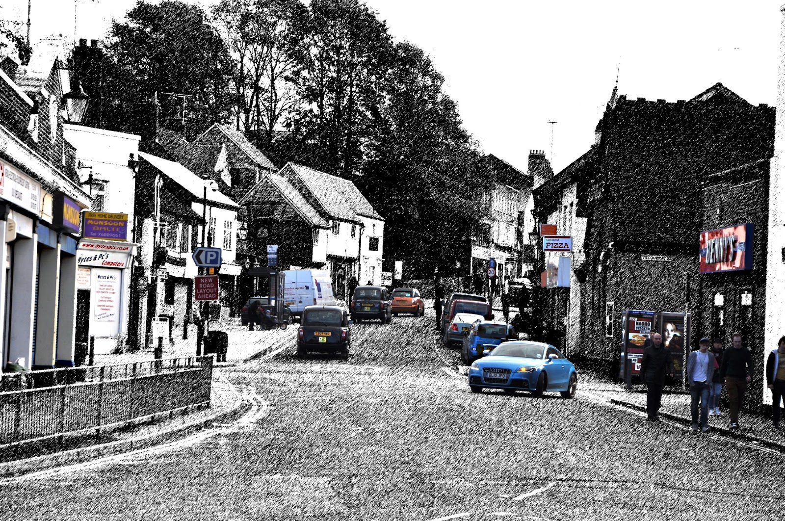


This is more effective as a poster idea. My focus here is on the people walking rather than on street features. They want to market the street as a thriving place to be; to live or to work. Therefore I have taken photos of the Street in the morning just as students were on their way to uni. This way the place looks busy. Secondly, I have taken the photo so that more of the street is in view. I have tried to capture the most historic of the buildings. The etching style for the street works quite well because it actually masks the parts that are not aesthetically pleasing (such as the kebab shop signs) and instead your focus is on the construction of the buildings and their history. I have used block colour for the road and for the sky because this is a street with a bright and colourful future and the contrast between the black and white buildings and the surrounding block colour I believe convey this message. There are quite a few issues with this piece however. For a start, the wording on the street is not effective. The words that I use convey the vision of the redevelopment, but they need a lot more consideration if this is to be a final design. Secondly, the people that are in the picture do not portray a nice message of the street as 3 or 4 of the youths are wearing hoodies. Perhaps a good shot would be when I see business people walk the street (they do often, it would just take a lot of time and set up to construct the perfect shot). One way I could develop this piece is if I take the buildings that I have photographed on Far Gosford Street and make collages of idealised layouts for the street placing emphasis on the history. Then this could be etched in this style.

This poster idea is a more successful piece I believe. It highlights the key historical features that most people just walk past. They are the features that most appeal to me, such as shop tiles that were branding of a shop in the past that have been cleaned up and incorporated in the modern shop frontage, or wooden beams that are constructed in a historically accurate medieval fashion. I love the W.Clarke advertisement on the side of the roof on one of the buildings. It is so subtle, but such a substantial and beautiful piece of history. It is features like this that I am going to focus upon in development work.
However, there are issues for me in this work. I have been subconsciously influenced by the existing design work for Far Gosford Street. I did not mean to, but I have used the circles to highlight images in the same manor as work already produced. Since I want to produce completely unique work, then this will not suffice. However I believe I have a good starting point here and some place to develop.
Key areas to develop are:
- The historic features that I am slowely discovering and appreciating. I want to share these findings with the people of Coventry.
- This contrast between a historic way of representing image and a modern way of representing image.
- A creative approach to the work rather than just another poster that advertises the redevelopment of the site. Something that explores the street in more depth and that fully understands the street and its history.
No comments:
Post a Comment