Alan Fletcher
This is the work of Alan Fletcher. I have chosen to look at Alan Fletcher for his use of colour. His images are so strong in colour and vibrant, they really stand out. The colour overlay image below is stunning, I love the effect of producing a third colour from two colours overlapping. Also, the image is bold and so strikingly powerful. Such vivid colours on a white background really makes the image stand proud. I think a strong colour pallette is required for the rebranding of Fargo Village. I do like the idea of having all of the elements of the rebranding hand rendered.
I like the bright, bold colours of the image above. Perhaps this is a good source of inspiration for the logotype of Fargo Village It would be great if I could produce a letterpress of Fargo Village in bright colours. I want to explore this concept. I also want to emphasise a handmade quality to all of the design work that I do for Fargo Village. I like the ink splatters on this image. They heavily contrast against the bright colours of the NAPOLI text and I feel that without these ink splatters the text would look very child like. For some reason, the splatters give the type an element of sophistication.
Richard Woods
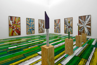
Richard Woods is extremely relevant research for what I want to do with Fargo Village. Here, he takes patterns of wood or features from old buildings and uses them to create surfaces that look like something they are not. For instance, a new build has the pattern of an old Tudor house because of the pattern that is printed onto the surface. I love this idea. This has really inspired me with my Coventry project. I want to take the patterns that I find in Far Gosford Street and make them into beautiful shapes to transform the warehouses, floor etc of Fargo Village to make it a fun and interesting place to visit. The colours used in Richard Woods work are very vibrant and strong, they are larger than life, vivid colours that look strikingly out of place, but I think that it is this that makes the patterns/surfaces work, they are just so interesting to look at.
Above, Richard woods has taken a tudor pattern, exajurated it and turned it into something that is visually beautiful and dynamic, and then painted it onto a newly built building. I think that the reason why Richard Woods work really works is because of the way he excecutes his projects. The patterns are recreated very convincingly and with great craft skill. There is a lot to be taken from this. The patterns are carefully constructed and great consideration has gone into considering the form of the building before the pattern is created.
This chair is fantastic. I am not sure of the material of it, perhaps it is plastic, but Richard Woods has painted a bright and colourful wooden texture onto it. He hasnt created a wooden texture in seriousness. If he had, it would not be bright colours. However, it is fun and engaging as an object. I am going to take a lot from this when I come to design patterns for Fargo Village. It has given me the breakthrough inspiration that I need to properly get into the project. I want to take inspiration for patterns from the old architecture from Far Gosford Street, the street which Fargo Village is off. Then, I want to make them bright and colourful and come up with a colour scheme for the whole rebranding of Fargo Village. This idea combines the old history of the street and the aspects that the developers are keen to highlight with the new, exciting vision.


No comments:
Post a Comment