Monday, 4 March 2013

pattern research

Corinne Wasmuht 1986-2001


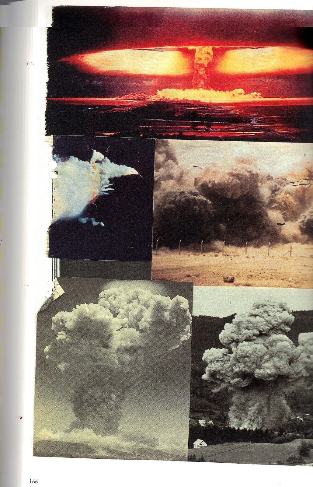
This is the collage style of Corinne Wasmuht. She takes photographs and turns them into really intersting photo montages. The randomness to the composition of these montages give them an unedited feel to them that i particularly like. I have already discussed that I want to highlight a handmade feel and quality to the patterns that I am going to create. Perhaps this is the way to go about it. The photos are arranged in a pareticularly aesemetic, rather random way. Each collage is completely different in appearance and visually dynamic. Although the collages look like they have been completed hastily on first impressions, further analysis shows that in actual fact a great attention has gone into constructing the compositions. Colours in every collage work well together. Hues of photographs have been carefully selected so that they compliment each other. 
I am going to experiment in creating patterns and then lay them out onto buildings in a similar way to Wasmuht's collages. I could create the patterns, and then crop areas to then drop onto buildings in an interesting collaged way. 

Max Ernst- Frottages

I was in the library researching and i found this really old book showcasing work by Max Ernst. I was going to overlook it until I opened it and started to read it. It showcased Max Ernst Frottage work. A style of rubbing that creates pattern out of texture. This is such a fantastic idea. Some of the textures and patterns that he has created through this process are amazing. Plus, it has the heavily textured, handmade quality that I really like and am trying to highlight through design. 


Adding colour to these rubbings, like above, create even more interesting and dynamic patterns. He carefully selected the surface before starting. They included floors, walls and embossed and debossed typography. 


Above is exactly the the type of feel of pattern that I want to create for the walls of the warehouses in Fargo Village. The pattern here is a repeat pattern, but because it has been created by manually moving the paper along, areas do not line up perfectly. This creates a beautiful rough feel to the pattern design. Perhaps this rubbing idea is a concept that I should explore when considering pattern construction for Fargo Village? I could make rubbings of the old walls, woodwork, flooring and typography that is down the street. 


Soft Surfaces- Judy A. Juracek


I have found this book most inspiring for producing patterns. It is a book that shows the potential of pattern making onto fabric. I think it is great source of research for my Coventry patterns. Above- Although these partterns are really intricate and illustrate floral which I am not really after, I have documented these images because of their use of colour. The colours compliment each other. This gives the patterns a more sophisticated feel. 


I really love the bleed effect that these died fabric patterns have. They look like they have been dragged to the left as they have gone through a photocopier (a trend at the minute in design). I particularly like the top image that is made of blue and white circular shapes. 


The image on the second row down, left side is exactly the type of pattern I want to aim to produce with my Fargo Village advertisement. It is an interesting repeat pattern that I think would look great on the walls of the warehouses in Fargo Village. I also love the colours used in this piece. Patterns look great when the background colour is a lighter tint of the forground colour. 


Thursday, 28 February 2013

The typeface in illustrator

I have started to put my typeface into illustrator. To do this, I have created a grid that is constructed by 2mm intervals, like the gridded paper that I used to design the typeface by hand. This will create a digital typeface that relates directly to the typeface that I have designed by hand.

This is me initially experimenting with the typeface and a logo. I wanted to quickly design a logo to get a general feel for the typeface in digital form and see if it was working. I believe that it is. I quite like the condensed feel and slightly high x-hheight. However, I am not sure about the drop shadow. I think that it looks a little weak and appologetic. So does the word 'village', but this is early days and just an initial concept. I do not know why I have not put the drop shadow lines on the g or o. I have added a texture over the image to make it look like the type has been printed. In actual fact, the texture should have been created using a white fill, but this is something that I can experiment with in future designs. I think that the type is looking balanced and clean. 

The entire digitalised typeface- Capital letters

I am going to show the alphabet letting but also the grid lines and the guides that I used to cosntruct the type. 


I then put a drop shadow on this typeface. I decided that I no longer like the single line drop shadow, so I have created a drop shadow which is fuller and has perspective lines. 

#
I am now going to use this typeface to experiment with possible logos and the creation of patterns. 


Wednesday, 27 February 2013

Secondary research for typeface and typeface development


My research into Victorian type and industrial Victorian signage has made me want to develop a typeface for the rebranding of Fargo Village. However, I do not want it to be a direct copy of a Victorian typeface, I want it to have aesthetic qualities of an industrial Victorian typeface but I want it to have the a modern overall presence.
Therefore, there are two major influences that I am going to use in the creation of this type. 


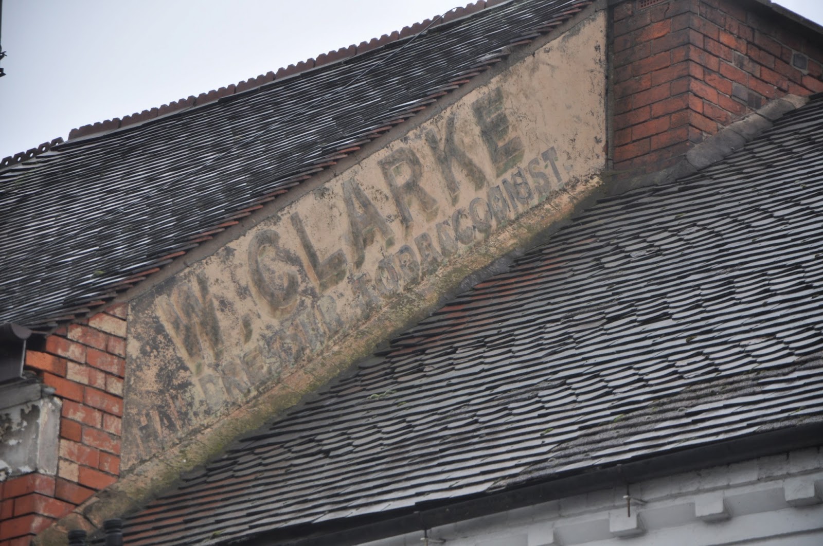
I found this on the side of a roof down Far Gosfrod Street. It is an origional Victorian sign that once advertised a tobacco company. Ok, so the actual typeface is not well designed, the K looks very awkward and there is a varying width of stroke width on letterforms which I do not think works. However, I quite like the proportions of the type. It is fairly condensed, and I also really like the way that the drop shadow works. It is the drop shadow that gives it its Victorian quality. 

The other typeface that I am going to use as influence to develop my typeface is a modern design. It is called Gotham and produced by Hoeffler and Frere Jones. In particular, I am interested in the medium weight letters and numbers. 


It is a typeface inspired by the industrial heritage of America- the type constructed out of paint, neon, steel and glass that is seen everywhere in the American Urban landscape. The typeface is straight forward and and simple. The letter forms are non-negotable and have a timeless modern feel to them. Hoeffler and Frere Jones describe the typeface as being "assertive but never imposing, friendly but never folksy, confident but never aloof."
I am going to take inspiration for formation of letterforms from this typeface. The way that letterforms curve, the way that ascenders and decenders attatch to the body of the type, the consistant x height of the type and also the thickness of the type stroke. I want a consistant thickness to all lines constructing the typeface and i want a medium/bold weight of font. 
I have also decided that I am only going to produce a capital typeface as my research shows only the use of capital characters in Industrial Victorian signage. 

Initial drawings


To develop all of the letters of the typeface I have drawn them all out by hand. This way I have more control over the minute details of each letter form. One of the most difficult aspects to the type design I have found is determining the x height. For the cross bar of the capital A, so that the letterform looks balanced, I have had to bring it below the x height. Also, curves in letters are particularly hard to get right. In my typeface, each curved line differs slightly. Some rounded areas are tighter than others. The third example page of experimentation here shows a drop shadow which does not connect to the letterform and which is illustrated by just one line. The thinking behind this is that I want the drop shadow of the letters to have a more contemparary feel to them than my Industrial Victorian Research. I am attempting to create a drop shadow with a lighter visual presence. Careful consideration has gone into the thickness of the typeface. On this gridded paper, I have determined that the optimum thickness if the cap height is 50mm to be 8mm. The width of the type varies from 30mm to 40mm. Generally, the type is 35mm in width. This gives the type an overall condensed feel that I am after (inspired by the Victorian type I found on the roof on Far Gosford Street). Some of the generally wider letters including the G and the A look awkward with a width of 35mm, hence the 5mm variance. Also, letterforms such as the L do not have the slight condensed feel that the other letterforms have when designed with a 35mm width, hence the 30mm value to the width of a few of the letterforms. 


Monday, 25 February 2013

Typeface

I have been considering what type face to use for all of my Fargo Village text in the re-design of the branding. My initial thoughts have been to look at sign writing in a Victorian style.


The above two images are particularly interesting to me. They are hand drawn, loosely created type with 'swirly' ends. I think that this style is really visually interesting and dynamic. It would look great with a lino-cut edge. Perhaps one way to approach this project would be to lino cut all of the rebranded elements, the signs, patterns, building frontages etc. This would give a consistancy to the design. However, I think that this does not really have a contemporary feel to it. I could create the type in this style using vivid colours (the colours that will make my colour scheme for the rebranding) but again, I am not sure how effective this will be as a rebranding for the Village. I think that I want a typeface that is both sensitive to the history of the place but also contemporary, clean and modern. This then brings me to the idea of using a typeface that references the victorian industrial era, where type faces such as egyptiennes and wide latins were used. 


This image is really effective because the type is in a completely separate, self contained box that separates the busy image from the type. This is a way which I could separate my text on buildings etc with the patterns, if I want to explore patterns that cover the whole building rather than just small parts or sections of the building .However, one other way to explore the patterns on the buildings would be to just have small references to them embedded in the type or on one of the corners of the type. This is definately something that I need to explore further. 


One aspect of the type that I have looked at here that I am particularly drawn to is the drop shadow on some of the characters. This creates a bold character with a 3 dimensional element.


I really like this logo. It uses a serif victorian styled typeface, and has the effect of being printed. It is very cleverly designed, the serif font for the name is balanced by the light, thin font that is below it. The contrast between the two creates an interesting balance. This is definately something that I wish to explore when developing my type. Also, the fact that the serif font is separated by containing it within a decorated box is also of interest to me. I am wondering what Fargo Village would look like in something similar, with a decorated edge around a containing box? 


The above style of text is a really effective use of a victorian bold serif typeface. The typeface is really powerful set against a black background, and is instantly associated with the era that it origionated. 
It uses the steriotypical light sandy yellow against a black background and horizontal and vertical lines structure the sign. This is typical of Industrial Victorian signage.  


I think that the drop shadow on the typeface above is particularly powerful. It is again typical of Victorian industrial signage. The serif font below this type reading "Jessie's Fold" has the feel of Vicorian industrialism that I am going to try and emulate through the design of a typeface for the rebranding of Fargo Village. 


Thursday, 21 February 2013

Research for rebranding of Fargo Village

Alan Fletcher

This is the work of Alan Fletcher. I have chosen to look at Alan Fletcher for his use of colour. His images are so strong in colour and vibrant, they really stand out. The colour overlay image below is stunning, I love the effect of producing a third colour from two colours overlapping. Also, the image is bold and so strikingly powerful. Such vivid colours on a white background really makes the image stand proud. I think a strong colour pallette is required for the rebranding of Fargo Village. I do like the idea of having all of the elements of the rebranding hand rendered. 


I like the bright, bold colours of the image above. Perhaps this is a good source of inspiration for the logotype of Fargo Village  It would be great if I could produce a letterpress of Fargo Village in bright colours. I want to explore this concept. I also want to emphasise a handmade quality to all of the design work that I do for Fargo Village. I like the ink splatters on this image. They heavily contrast against the bright colours of the NAPOLI text and I feel that without these ink splatters the text would look very child like. For some reason, the splatters give the type an element of sophistication. 


Richard Woods
Richard Woods is extremely relevant research for what I want to do with Fargo Village. Here, he takes patterns of wood or features from old buildings and uses them to create surfaces that look like something they are not. For instance, a new build has the pattern of an old Tudor house because of the pattern that is printed onto the surface. I love this idea. This has really inspired me with my Coventry project. I want to take the patterns that I find in Far Gosford Street and make them into beautiful shapes to transform the warehouses, floor etc of Fargo Village to make it a fun and interesting place to visit. The colours used in Richard Woods work are very vibrant and strong, they are larger than life, vivid colours that look strikingly out of place, but I think that it is this that makes the patterns/surfaces work, they are just so interesting to look at.


Above, Richard woods has taken a tudor pattern, exajurated it and turned it into something that is visually beautiful and dynamic, and then painted it onto a newly built building. I think that the reason why Richard Woods work really works is because of the way he excecutes his projects. The patterns are recreated very convincingly and with great craft skill. There is a lot to be taken from this. The patterns are carefully constructed and great consideration has gone into considering the form of the building before the pattern is created. 


This chair is fantastic. I am not sure of the material of it, perhaps it is plastic, but Richard Woods has painted a bright and colourful wooden texture onto it. He hasnt created a wooden texture in seriousness. If he had, it would not be bright colours. However, it is fun and engaging as an object. I am going to take a lot from this when I come to design patterns for Fargo Village. It has given me the breakthrough inspiration that I need to properly get into the project. I want to take inspiration for patterns from the old architecture from Far Gosford Street, the street which Fargo Village is off. Then, I want to make them bright and colourful and come up with a colour scheme for the whole rebranding of Fargo Village. This idea combines the old history of the street and the aspects that the developers are keen to highlight with the new, exciting vision. 

Thursday, 14 February 2013

Colour Scheme

The colours for this project I am going to take directly from London's Brick Lane. This is because they have been inspired by Brick Lane throughout the development of Fargo Village. They want it to be like Fargo Village. This is their vision. They want it to be a vibrant, colourful and interactive space.

After exploring many possible colour schemes, this is my final choice for the redesign and rebranding of Fargo Village. The colours have been heavily influenced by photographs from Brick Lane. The colours have a very slight earthy feel to them which was intentional. I do not want the warehouses to look like a toy town. I think that if the colours were more vibrant, then I risk this happening. Because Fargo Village will be an artizan quarter it has to have a sophisticated quality to the overall colour scheme and design. 

Friday, 8 February 2013

Fargo Village


This is a panaramic view of the buildings faces that are in the 'to be' Fargo Village area. I simply took all of the buildings (and side of buildings) face on. The problem that I had was that firstly, it was taken whilst there was quite a few cars there. This was unnavoidable because it was the only time of day that I could get into Coventry. The other problem was the width of lens and the distance that I could get from the buildings. Because I could not stand far back from them (the area is contained) I had to use an 18mm width lens, meaning that I got distortion on some of the buildings because of perspective. However, I plan to take these photos into illustrator and create line drawings of an interpritation of the buildings that are in Fargo Village. The buildings will not change too much when they redevelop them for Fargo Village, so it is fitting that I do not make too many changes to them too. Instead, I am just going to trace the outlines of the buildings, removing any feature that will obveously be removed, such as the old battered staircase down the side of one of the warehouse styled buildings. Hopefully then I should have a flatplan of all the buildings that will make Fargo Village that I can add my suface patterns too.